Kao Collins Fade Resistant Inkjet Inks
Download
You’re driving or walking, minding your business. Each day it’s the same: don’t get a ticket, don’t bump into someone with their head buried in their smartphone, and watch for the brake lights.
Ignore the billboards.
Then, one day, a billboard catches your eye, maybe both eyes. It’s a jaw-dropper. These are the ones that get the message across quickly and creatively. They’re the billboards that make you say “wow.”
Stunning billboards along with the yawners are often printed on wide-format inkjet printers using solvent-based ink or latex inks that are resistant to fading.
Below are 8 billboards that will stop you dead in your tracks. Please keep the rubbernecking to a minimum.
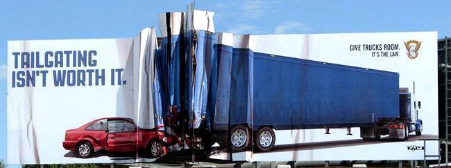
8. Colorado State Patrol | Don’t have a wreck looking at this…
 Hoping this is never you. It looks so real thanks to the clever design and break-out from the rectangular shape of the billboard. The eye-stopping billboard from The Colorado State Patrol costs a little more, but the campaign got a boost from media attention – like this. Image Source: Idea Connection)
7. Berger | And it saved ink…
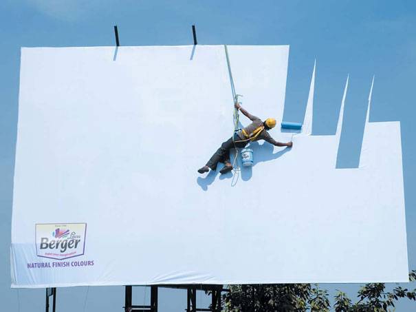 Sometimes less is more. It looks so real with what appears to be the live creation of this billboard. This one works on another level: not much ink was used. (Image Source: Inspirational Feed)
6. McDonald’s | The sun shines on this ad
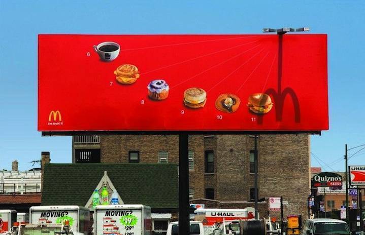 Who needs a watch when you have McDonald’s telling you the time. The Leo Barnett agency went totally retro using a sundial to tell hungry people the best breakfast-menu item to have at different times of the morning. Here’s hoping the sun always shines so we don’t have to decide. (Image Source: Designmodo)
5. BBC | Dimensional storytelling
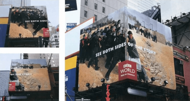 The design team took full advantage of the real estate available to tell the story for BBC World. The message would have worked on a flat space, but corner accented the headline. It took over 200 square meters (Image: AdAge Creativity Online)
4. Frontline | An ad that’s itching to be seen
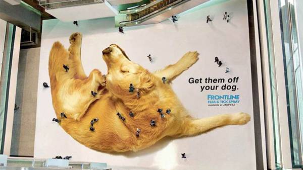 Shoppers became flea-size players in this ad for Frontline Flea & Tick Spray. For anyone looking from above in this multi-level mall they could see the the humans-as-fleas crawling all over the giant dog. It took over 200 square meters of stickers to create the massive golden retriever. Ad agency Perwanal Saatchi & Saatchi in Jakarta, Indonesia developed the campaign. (Image Source: Canva)
3. Anando Milk | Look out below
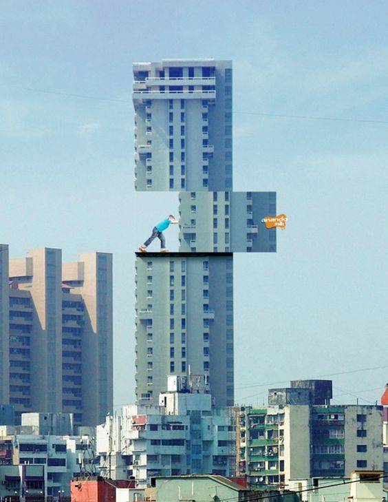 Not all billboards have to be nestled up to an expressway. Anando Milk in Mombai, India wanted to get kids there drinking more milk and stand out from the competition with fruit juices and energy beverages. Ad agency McCann Erikson, um, pushes the envelope of creativity with this eye-catching gem. (Image Source: Digital Synopsis)
2. Nationwide Insurance | Advertising meets reality – so it seems
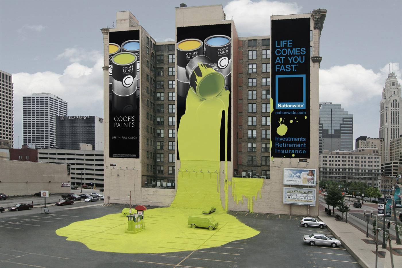
Nationwide Insurance went all in – or out – to showcase their “Life Comes at you Fast” campaign. Who wouldn’t, at least for a moment, believe the paint spilled onto the parking lot. TM Advertising of Texas took over three building billboards and part of the parking lot for what amounted to a street art installation. (Image Source: Marketingmag)
1. Oldtimer | Are we there yet?
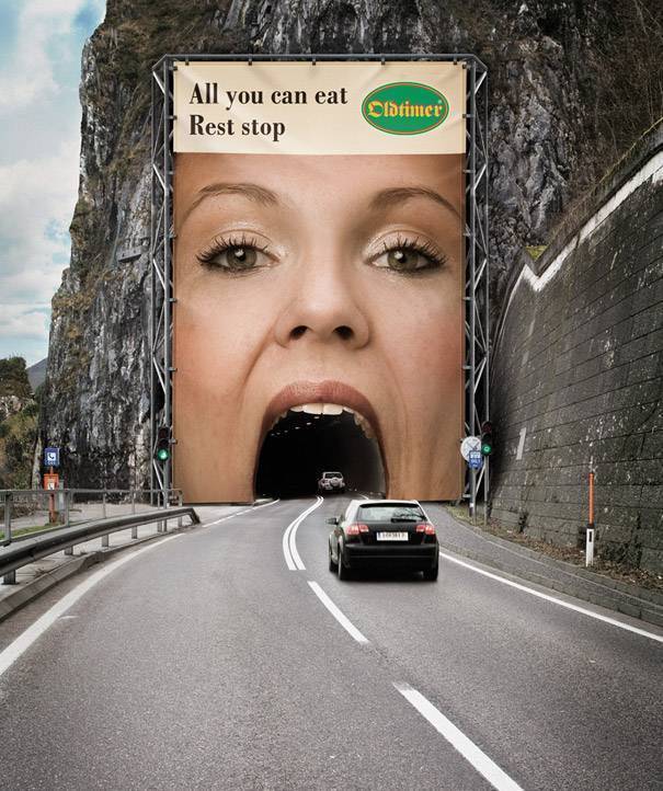 Drivers didn’t have to turn their heads to get the message because it was right in their face. “Oldtimer” chain of rest-stops in Austria wanted to make sure you knew they were “open” for business. The Demner, Merlicek & Bergmann agency in Vienna created this gem. (Image Source: Bored Panda)


